Modern Poetry Novels
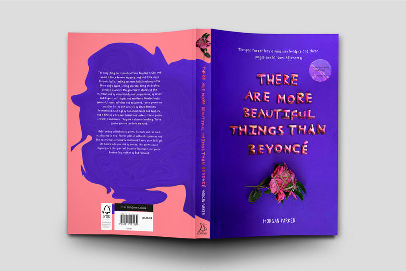
To attract my audience of 18-30-year-old preliminary females influenced by poets including Rupi Kaur, aiming to get them interested in poetry by helping them to understand abstract poetry. This is successful by exploring playful art-directed photography and typography with natural materials including flowers, seeds, natural stone and clay to bring together natural emotions, attitudes and natural products from the camera to the paper stock. The shapes are used to create strong compositions. Relating to the interpretations, characteristics of the poems with the theme of growth and struggle. Created my own typeface and font family from my audience’s handwriting to give a personal, human touch.
ATTIRE Magazine
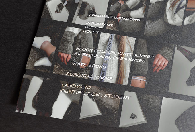
Attire is visual based with typographic elements. ATTIRE highlights outfit roles in important events of the world. We aim to educate our audience about life’s most important events and remembrance in creative forms including collages, reels, and tactile elements including stickers and tip in pages. We explore various important attires in people’s lives through a pandemic and document experiences for those who aren’t associated with the chosen roles and future generations. We consider roles of all ages and backgrounds. We consider sustainable packaging and elements from page to the shelf.
Influenced by Cactus Magazine through frozen silhouette and pattern. Inspired by my family with different roles in the pandemic.
'ONCE IN A BLUE MOON' Publication
The first A2 publication of the RGB limited series ‘Evolve’.
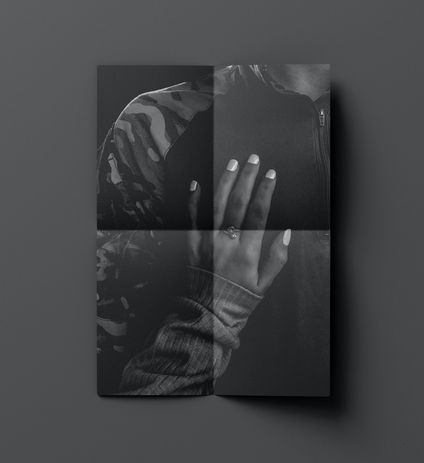
Influenced by the rarity of blue, I juxtaposed 18–24-year-old fundamental perspectives with my new perspective using the theme of uncomfortable, narrating the transformation of becoming blue. A restrictive, black-and-blue contrast of art-directed objects conveys human involvement, emphasising texture for an uncomfortable feel. The typography of my audience’s handwriting is embossed to give ‘Blue’ identity and a sense of feeling human.
Kept together with a portrait belly band, series title de-bossed on uncoated paper for an uncomfortable rough texture and saddle stitched binding to hold the large scale taut. Benefiting from a community engagement, handled by multiple people, and a big space to engage with.
'SCRIBE' Book Subscription Brand
My concept is to provide resources using a personalised book subscription as a healthy way to escape for ages 18-40 escapists led through personal experience and my interest in literature. My core idea is escaping through my two phases, reading and designing.
Scribe promises to provide and deliver a safe and healthy space to escape. To learn traditional and contemporary literacy with high-quality touchpoints. My unique selling point is my customer picks a book genre and create their book sleeve so it is personalised to them. The colour and genre illustration varies depending on my customer’s choice of genre. My brand uses the element of sustainable packaging.
'The Diddlyumptious Times'
Re-interpreting Charlie and the Chocolate Factory
A3 newspaper portraying the children’s characteristics in Charlie and The Chocolate Factory. Using the theme of greed to motivate my audience of 18-24 years old to donate and take action following the moral of the narrative, good people get rewarded. The idea that my audience donates to help a cause, and gets put in a prize draw therefore is not definite but still is a chance. Puzzles have been incorporated throughout and my art-directed images include ‘NSPCC’ letters for my audience to engage with. My audience has to dip the newspaper in cold water to activate the interactive ink. This reveals the puzzle answers. Folded binding. Thermochromatic ink reveals puzzle answers. With 80gsm uncoated newsprint.


